My goal for this guide is to show Internet marketers how they can use all of the various types of charts and graphs at their disposal to visualize their data and find actionable insights. I used Annie Cushing’s MozCon 2014 presentation and her Comprehensive Guide to Excel Charts for Marketers video, along with Microsoft’s guide for available charts in Excel to compile this manual.
Column & Bar Charts
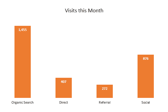
Column charts are best for data that is not continuous and is better shown separate.
“For the most part, the column chart is my go-to chart.” – Annie Cushing
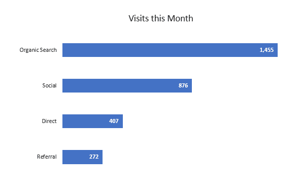
Bar charts work for the same situations as column charts, but should really only be used if axis labels are long.
Line & Area Charts
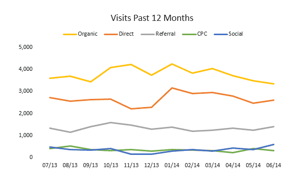
Line charts can show continuous data over time, so they’re ideal for showing trends in data at equal intervals, like months, or years.
Stacked area charts are great for showing how different groups comprise a whole over time.
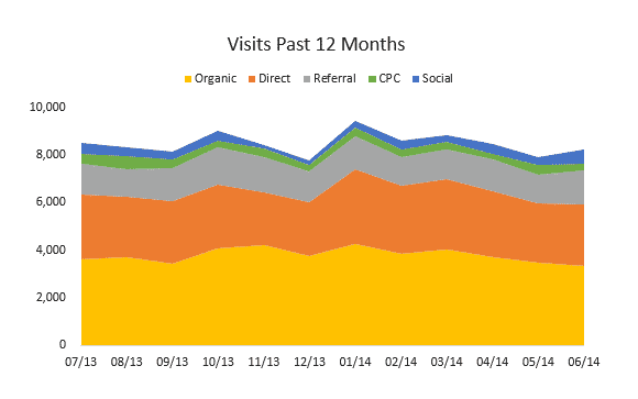
Pro Tip: Stacked line charts are hard to decipher, and are better as stacked area charts. Likewise, area charts can be misleading if they aren’t stacked.
Pie & Donut Charts
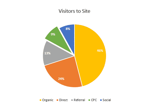
Pie charts are used for displaying data that adds up to 100%. The chart uses angles to show the relative size of each value.
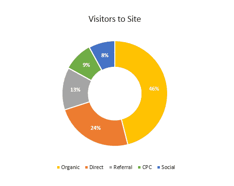
Donut charts use the length of an arc to indicate the size of the value. Donut charts are essentially the same as pie charts but they have a hole in the middle and categories can be shown separately to focus on their values.
—-
Radar & Scatter Charts
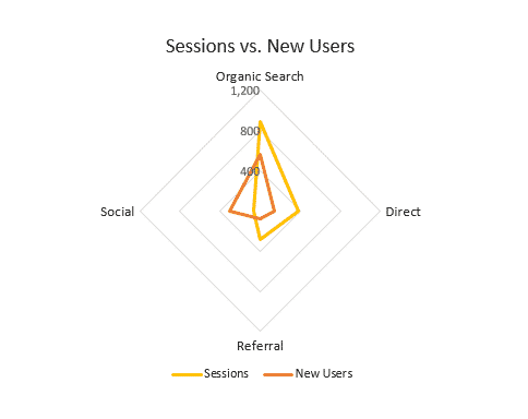
Radar charts can work well when comparing multiple data sets. Category labels are at the tip of each spine, with the incremental line values indicated.
Scatter charts are great for comparing data series and seeing if they have a positive or negative correlation between their data points.
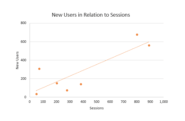
Pro Tip: Add a trendline to scatter charts to see the general correlation of data points.
Check out Annie Cushing’s Guide to Excel Charts for Marketers video to learn how to make all of the charts pictured above.
Crazy Cool Charts
These charts show unique ways to visualize data using some of the chart styles shown above.
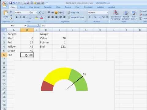
- Speedometer charts are nice for showing whether a data value is where your company wants it to be, or if it’s lagging in the danger zone.
- Bullet column and bullet bar charts show progress against a goal with a target value and the actual value displayed.
- Thermometer charts are another way to show progress against a goal. You would have the top value of the chart be your goal value and show the actual value represented by the mercury.
- Two-sided bar charts allow you to compare two different data series side-by-side.
- Scrolling charts are a cool solution for when you have a huge data set but don’t want an excessively wide chart. Horizontal scroll bars can work for line, area, and column charts while vertical scroll bars are great for long tables on dashboards.
That’s my basic overview of charts and some of the fun things you can do with them. If you’d like to delve deeper into data visualization, I highly recommend checking out Tori Cushing’s tutorials on pivot tables and pivot charts! You can also have visualizations made for you by the free data visualization tools listed in my previous blog post.