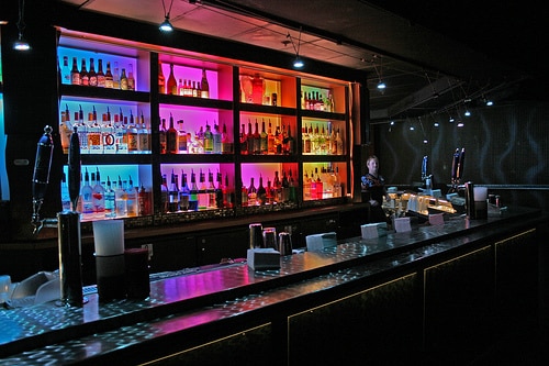
Retail stores at the mall, restaurants, hotels, and many other businesses are more successful when they create a brand experience and mood using their location. Branding can be coded into your office’s architecture, decor, music, and packaging, which empowers your company to be associated in customers’ minds with certain aesthetics and values.
For example, Abercrombie and Fitch retail stores create storefronts that create a college house party mentality, with blaring music, the smell of cologne, and decor like shutters and couches that evoke a hip, fashionable home. Apple retail stores also gear every aspect of their environment toward a specific brand image. Grey stone floors and uniform wooden tables create a streamlined, clean experience in stores across the world.
These strategies are known as “environmental branding.” Website design is the digital version of environmental branding, and is becoming more important than ever to build a consistent, effective brand image.Take a look at these five great ways to practice environmental branding both on and offline, and create a memorable experience for your customers.
1. Lighting
A romantic visit to a gourmet restaurant should evoke a mood that’s different from entering a startup tech office. Lighting plays a crucial role in conjuring either of these experiences. Couples chatting and laughing over their food should be illuminated by the soft glow of candles, whereas a tech office will probably have bright fluorescent lights to keep coders away during late hours.
Just like on a movie set, lighting can contribute to a branded experience, making the atmosphere more memorable for customers. The type of lighting you choose for your office, restaurant, or retail location should gibe with the feelings your product evokes.
Similarly, your website should convey colors that portray your brand image, or make your users feel comfy and cozy while they visit.
2. Signage
While this may seem obvious to many storefront owners, we have all seen poorly made signage. Taping a sheet of printer paper onto a window is sloppy; it shows very little care for public presentation. No matter how trivial the message, the font, medium, and display should be tailored for your brand.
Bookstores and antique retailers may consider rustic signage with serif fonts, which create a sense of reverence toward history and tradition. Modern furniture stores and design offices may wish to use digital signage with san serif fonts and abstract artwork. Signage should mesh with your brand image.
When it comes to website design, think about your brand logo and the overall look and feel of your site, and what sorts of thoughts or emotions they might evoke.
3. Textures
Some people might not think that the texture of fabrics, walls, and carpeting matter when they visit a store or office. However, these details contribute to the overall brand experience.
Can you imagine walking into an Apple store and finding the walls covered with antiquated wallpaper? This would detract from the modern and minimalistic look that Apple seeks to convey with its products and atmosphere. As you tie together your space with furniture, pay attention to the upholstery. The textures should not work against the three-dimensional space of your office or store.
Textures are important in website design, too. Most websites have a background texture which acts much like the the texture on physical wallpaper to evoke emotion. Is it smooth or rough? Is it light or dark? Is the embossing deep or shallow? All of these can lend to your brand image and improve user experience online.
4. Scents
Specific smells evoke memories, like the way the smell of crayons takes you back to kindergarten. Scents don’t need to be overwhelming; subtle smells work for environmental branding just fine.
Restaurants know the value of using smells to market their food. Bakeries often vent the smell of fresh cookies and bread out to sidewalks, which draws in hungry pedestrians by creating memories of delicious scents.
And if you’ve ever been to the Aria at Las Vegas, you know the pleasant, patented smell that permeates the casino floor. This smell has been shown to keep gamblers on the casino floor longer, causing them to spend more money.
When it comes to website design, scents aren’t a part of users’ website experiences yet, but wouldn’ that be cool if the technology was developed in the near future?
5. Trade-fair Booths
You can recreate a brand image and experience at a trade show, enabling visitors to feel what it’s like to walk into your shop or office. Use booth signage, presentation monitors, banners, and other visual markers to get brand logos and messages out.
Decor should reflect the same color themes and textures as your store or office furnishings. If your retail location is filled with particular scents (like baking smells or potpourri), try to reproduce that in your trade fair booth. Brands with this type of continuity will guide customers to expect a particular type of experience wherever they encounter your company’s presence.
The parallel between trade fairs and online marketing can be seen in external publishing efforts. For example, participating in a forum discussion where your target market and/or peers are engaging. Another example would be publishing a guest blog on an external publisher. Even participating on Twitter or Facebook and engaging in discussions with your target market or peers is an example of a parallel. Essentially, your goal should be to get your brand out there and interact with others, build relationships, and build brand awareness.
