
The Scarlet Mobile Letter
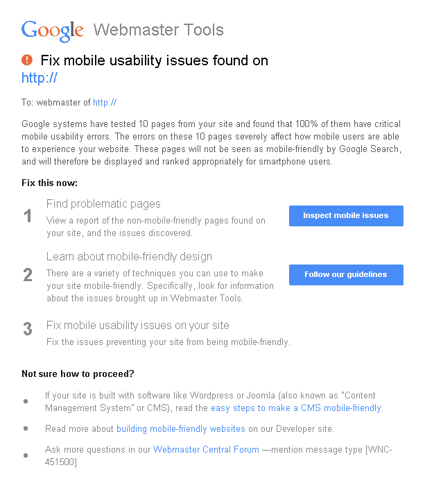
If your client has recieved this email then you are among the thousands of SEOs who have been shaken into action by Google’s pending mobile update. Could I include graphs and infographics that show the increase in mobile use by online customers, of course but that’s not really important right now. What’s important is how do I fix this and prevent my client (or my own site) from losing rankings because it’s not mobile friendly?
An Update Like No Other: They Actually Tell You Specifically What To Do
Pass/Fail. Yes/No. In order to push the business world into paying for mobile friendliness Google is sounding all of the alarms, and making SEOs jump to take care of those mobile accessibility issues that have malingered in the background of Google’s page speed insights for the past year. However, this is not a subjective update where the criteria are vague or abstract and implemented on degrees.
“Will degrees of mobile friendliness impact rankings? E.g. two sites, same SEO, both mobile friendly but one site has a better mobile experience. Would the site with better UX on mobile rank higher in mobile search?”
“As we mentioned in this particular change, you either have a mobile friendly page or not. It is based on the criteria we mentioned earlier, which are small font sizes, your tap targets/links to your buttons are too close together, readable content and your viewport. So if you have all of those and your site is mobile friendly then you benefit from the ranking change.” – Mary from Googl at the 47:10 mark and here’s the full Q&A session:
In case you missed that, they cited 4 concrete, specific pass/fail criteria for you to check.

How to Set Your Mobile Viewport
This meta element basically communicates with your browser to set the initial size of the screen so you don’t end up with 1/2 the page content unviewable which is a terrible mobile experience.
<meta name=”viewport” content=”width=device-width, initial-scale=1“>
Articles on how to configure your Viewport
Size Tap Targets Correctly
If you have been using your smart phone’s browser for more than a day, you’ve run into a situation where you’re trying to click a link that right next to another and you’ve got less than a 50/50 chance of getting it right the first time. This is an unfortunately common occurance, so I for one am happy this made the list of issue for Google to target.
Tested 15 mobile sites on Google’s “Size tap targets” rule. Only Zappos won https://t.co/0aOX8Xz8xV pic.twitter.com/iJ1dmr9uJO
— Cyrus Shepard (@CyrusShepard) November 14, 2014
Articles on how to size your tap targets appropriately
- Google Developers: Size Tap Targets Appropriately
- Smashing Magazine: Finger-Friendly Design. Ideal Mobile Touchscreen Target Sizes
- Feed the Bot: Size Tap Targets
Appropriate Font Sizes For Mobile

Your site’s not going to be very useful if the font is so small that it’s illegible or the users have to pinch to zoom to be able to read the text.
Articles on selecting font sizes that work on mobile
Mobile Readable Content

It’s tempting to block all the bots you know are scraping your site, but you may accidentally be blocking some vital elements with that robots.txt file. If Google can’t render your site correctly because Googlebot is being blocked from accessing resources you refer to in your site design then you just might fail the mobile friendly test. This often happens in wordpress when you’ve disallowed /wp-content or /wp-includes in your robots.txt file.
Articles on finding blocked resources:
- Feed The Bot: Do not block page esources
- Moz: Robots.txt best practices
- Yoast: WordPress Robots.txt example
Have your sites already been affected by the update? Any other major mobile friendly action items that you have on your list? Please share in the comments!