 Recently, during a meeting hosted by our CEO where we discussed do’s and don’ts of web design for Advice Interactive, I couldn’t help but go ranty.
“Don’t put poop on the page,” I said, which was met by raucous laughter. “No seriously, we wouldn’t put poop in the page and expect it to convert, so don’t use stock images, don’t over-power pages with piles of text, don’t use the main nav as a trash bin. User experience is a priority I think many of us tend to forget.”
I couldn’t help but “go in” on UX (or lack thereof), a topic I think content marketers as a whole give short shrift. Yeah, we say we care about conversions, but the road we travel to get there is convoluted, messy and winding. It’s as though UX, IA and content strategy are nice-to-haves, thrown in to add flavor to an otherwise bland, inedible dish.
We don’t recognize the fire we’re playing with, a fact laid bare in a recent piece on Portent.com.
“UX is the new way to optimize sites for search engines because Google said so,” writes Marianne Sweeny, senior SEO strategist for the company. “Yes, that benign search giant has decided that links are no longer as important as they once thought. Out of deep concern for its users that click on the search ads, Google has decided that user experience (UX) is a much better determinant of relevance. This left the entire SEO is gob-smacked and floundering, at least those that have not already stepped off the ledge are.”
Sweeney’s point is not that algorithms are the best judge of useful content. Rather, she smartly suggests that by taking an interdisciplinary approach to SEO, IA, UX, Interaction Design and content strategy, we effectively prove that humans are perfectly equipped to handle the task of assigning value to content.
For the moment, however, let’s place aside the notion of whether or not Google should be the final arbiter of UX. Instead, let’s focus on how we can take advantage of this reality, rescuing our blogs from the clutches of mediocrity in the process:
- Stop it with the thin, too-long content. Come on, people, we all heard of Google’s Panda updates, and how they slaps sites with thin content. Why are you still slapping up pages, then, that do nothing but drive prospects away from your site without converting? I’ll tell you why: We all know how to game the system to get people to the site; the best SEOs keep them there with engaging, inviting content that is quashes objections, answers questions and reinforces the brand as the go-to resource in the category.
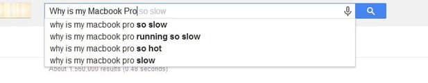
- Keyword stuffing—Don’t do that! I’ve analyzed client’s sites and found so many keywords on the page that I wanted to congratulate the writer for being so talented. How about 87 exact match keywords in a 376-word document? I witnessed that recently. It was neither pretty nor effective. Google gave savvy content marketers a gift with the Hummingbird algorithm, which rewards content that speaks to user intent. Why not use this to your advantage. Instead of thinking “keywords,” think “language of the user.” For example, some with a computer issue is likely to type “Why is my Mac screen blank?” not “Where can I find a computer technician in…?” See my point? While you’re thinking keywords, those SEOs welcoming semantic search are eating your lunch.
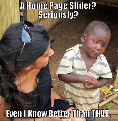
- Reward, not punish, your site visitors. I hate to keep highlighting the Google menagerie, but when Panda slammed sites for a poor user experience, it provided a great opportunity for content, SEO, UX and IA folks to work together to drive value to site visitors, rewarding them with rich design, content and navigation. Many of us ignored the “mandate,” preferring to focus more on appearance than substance—i.e., recency of content with blogs, well-placed social buttons and content folks would find useful. Join the game by making site speed, site readability and content layout priorities. Simple steps that can have an immediate impact include doing away with the main page slider in place of a large static image; breaking up blocks of text with “other related content” sections; linking to similar pages on tour site; and making it easy for visitors to share your content by making social share button obvious, not hidden at the bottom of the page.

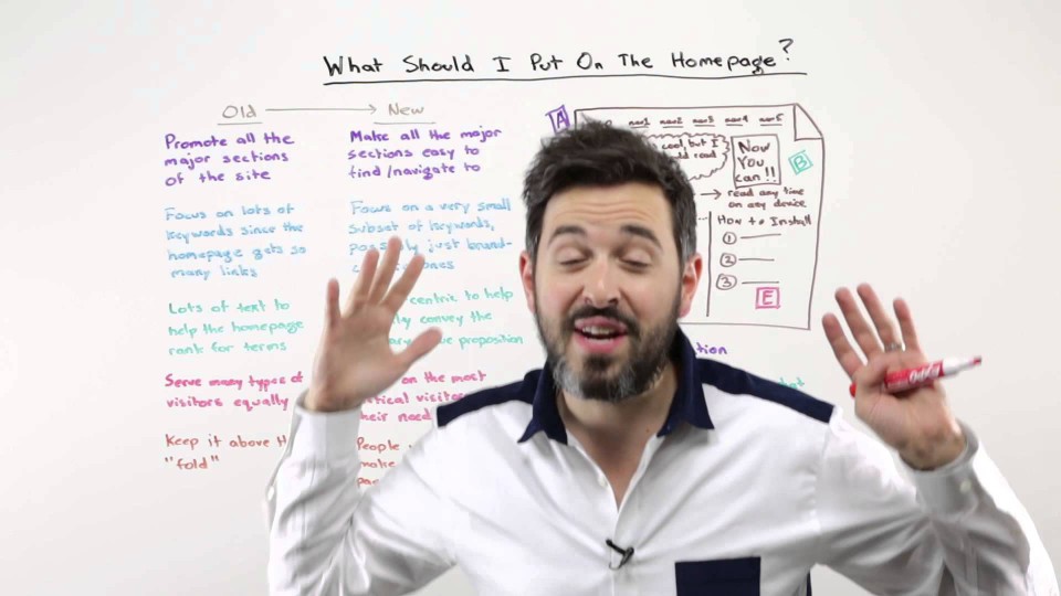
- Lose the graphic-vomit. We all received the memo to “cut it out with the Infographics.” Apparently we listened, for there are fewer of them showing up on sites. However, now everyone apparently thinks it wise to make the home page a depository for every bad image in their Dropbox account. The key to stellar web design is simplicity. Visitors came to your site for a reason. Make it simple for them to complete their desired task. Instead of you listening to me “go in” on the topic, here’s a screenshot of a whiteboard presentation detailing what successful website design looks like from Moz’s Rand Fishkin:
- Stop hiding relevant content. I’ve said in meetings that, “Few website visitors know what an IA is, but they sure as hell know when one has not been involved in the layout of a website.” It’s like finding the toilet in the sink: testimonials hid in the footer, calls-to-action (CTAs) all but impossible to find, blogs obscured by layers of tabs in the main navigation, and no discernable strategy to the content offered. I know many web design projects do not have an IA involved, but you can still ensure that your website features a layout that mirrors your goals by following these three steps:
- On a large whiteboard, identify the four to six categories that must go in your main navigation using Sticky Notes
- Under each one of these categories, add the secondary and tertiary categories that should fall underneath each using Sticky Notes of a different color
- Look again at the items in the top level—can any of them be combined?
A good place to start on this journey is Centerline Digital’s Content Planning Jumpstart Guide:
In my experience of “grading” small business sites for redesigns, the top level in the main navigation is where things go awry. If we can keep the wheels on there, things seem to fall into place more naturally underneath, which can have a cascading effect on the rest of the site.
In case you haven’t noticed, I was tickled pink at Sweeney’s blog. User experience must take greater prominence. By placing users first, we worry less about disciplines, approaches and put the focus on helping our audiences attain their goals.
What do you think?

