This is the next step in the Excel for Noobs series. If you missed the first one, check out how to make format your data, organize it in a table and create a simple bar graph. This tutorial will go over conditional formatting!
Let’s start with this first step, making it pretty. Just as I said in the last post, making your data pretty is essential for readability and clear communication to everyone who isn’t an excel nerd.
In my last post I went over a few simple ways to make your data prettier. Here is the list of items, but feel feee to referenced my last post if you don’t have these committed to memory yet. Hide gridlines, delete or hide unnecessary data, give the document a title and add a 10px cell padding in A1.
Everyone Loves Colors

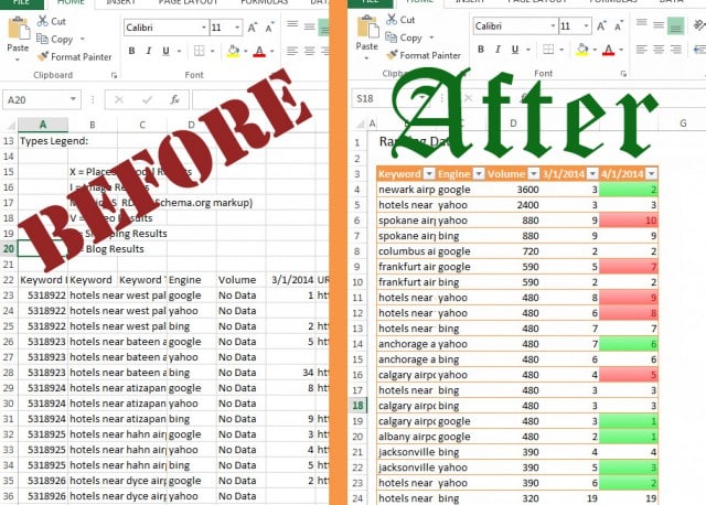
Conditional formatting is a quick and easy way to visualize the data you want to show using color coding. There are many different ways to use conditional formatting. So many, that it could merit its own blog post. But today, we’ll focus on simple cell coloring. We’re going to take the ranking data from your AuthorityLabs export and color code it with green and red gradients to show improvements or losses in a month of rankings.
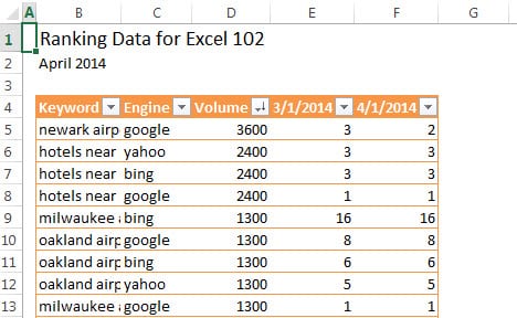
To do this you will need to set up your export as I’ve set mine up. You can download what I’ve done so far in my document.
So, let’s start painting.
You’ll want to start with F4, this cell is what we will be comparing the rankings to. The whole idea is that we want to see if the ranking for that keyword has gone up, down, or stayed the same in the past month.
Start by selecting F5.
Under the Home tab select the Conditional Formatting> Highlighted Cell Rules > Greater Than…

Next…
Select the cell E5 and get rid of the dollar signs so that it is a relative selection. This way we can drag down the formatting to the other cells.

Then change the formatting.
Select Format and under the Font tab select red.

Next, you will add two more Conditional Formatting rules for this row of data.
One will be Less Than which is the color green, and Equal To… which is the automatic black text formatting. The final product will look like this.

Here’s the easy part!
With the cell F4 selected, click the Formatting Painter which is under the Home tab. Then drag the Format Painter down your column of cells. It should look like this:

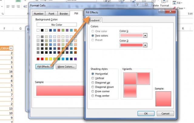
The final touch is to add a pretty gradient behind the formatted cells.
This is makes the data really pop. To do this, select that table column (4/1/2014) and open the Conditional Formatting > Manage Rules. In this dialog box you can select a rule by clicking on it.

Then, click on the Format button to get the formatting options.
Under the Fill tab select Fill Effects. From here I selected a darker and lighter shade of red and green to create gradient backgrounds.
Now time for a victory dance!!
You have successfully used Conditional Formatting to show the behavior of keywords over the past month. Stayed tuned for more Excel geeking out in the next post!

Want more Excel help? Join our first AuthorityLabs 101 Wednesday hangout on April 30th! You will be able to ask me questions about Excel tabling and graphs.
