Whenever I think of improving dwell time on pages, that classic scene from the movies plays in my head.
It’s the scene where one of the “good guys” has to distract a not-so-bright sentry, while the rest of the heroes slip past undetected. We watch as the character goes to comic lengths to keep that guard from looking over their shoulder at the escaping party.
This isn’t far from our intentions when optimizing for dwell time, right? We’re trying to do everything in our power from keeping the visitor from clicking the back button and returning to the SERPs.
In this discussion, we’ll take a look at dwell time and the small steps you can take towards keeping traffic on your pages for longer.
Why Do I Care About Dwell Time?
Before getting into the content tips, it’s important to understand what dwell time is, how it differs from other metrics and what it can tell us about a page.
In short, dwell time is how long a visitor stays on your site. It’s the actual minutes, seconds or hours from when they first click onto the page through the SERPs, to when they leave your site. This is similar to time-on-page metrics, but tracks the visitors entire stay on your website.
While Google has been tight-lipped about the impact that dwell time has on rankings, we can surmise that it has a positive effect on rankings to some degree. After all, Google aims to showcase pages with the most authority at the top of the rankings. When someone stays on a website for a long time, it demonstrates that they found useful, authoritative content that was worth sticking around for.
Surround Content With A Great Layout And Site Functionality
Layout in this section, refers to what the overall page looks like. We’ll take a more detailed look at specific elements of content layout in the later sections of this layout. We also have to consider functionality. If pages load too slowly or don’t display correctly, it doesn’t matter what your content looks like because people won’t stick around long enough to see it.
This is an especially big concern with mobile users, which need an experienced catered to the touch screens of their devices.
Some web experts recommend using a pageless scrolling design because they work well on both mobile and desktop screens. The aspect of “scrolling” through one continuous page is an experience that we’ve become familiar with (and borderline addicted to). However, implementing the one-page scroll environment can harm your SEO and page load speeds, if done poorly.
Here’s how you can avoid this:
- Fixing SEO Issues: You need to signal to the search engine bots indexing your page that, despite endlessly scrolling, your site is actually a bunch of individual pages/content pieces one after the other. To do this, you need to define each section with a <title> tag, rel=”next” and rel=”prev” values written in the heading tag.
- Fixing Page Speed Issues: The one-page design creates a more robust single page, which likely demands more resources to properly load. A lot of developers opt for a dynamic loading design, which loads content as the user continues to scroll. Even then, you can run into issues as the site “buffers” the next sections of content. Thus, you may want to look for ways to decrease page load times other ways, like using GZIP compression, optimizing images and video content, caching the latest version of your site, and so on.
The Headline
Every headline you create, even if dwell time isn’t on your mind, should be immediately engaging to pull the viewer in. Without that initial allure, most potential content-consumers will click away or find a more eye-catching headline elsewhere. There are three parts of your headline to consider with dwell time in mind:
- Headlining Image
- Title
- Remaining space (introductory text)
The headlining image should be relevant to the topic at hand. A lot of people rely on stock images, as this helps present a clean, professional persona that suits the needs of most brands.
Yet, some consumers find this look to be a little too overplayed and only 7.6% of content marketers found these photos to yield the best engagement, while 41.5% reported that original graphics and data worked best.
Some brands find big boosts to engagement by hiring a graphic designer to create some unique headline photos. Don’t be afraid to even take a photo yourself, especially if you have a quality camera on your mobile smartphone.
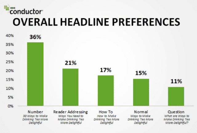
Titles have been the cause of much agony and anguish on writers for centuries. Luckily, there’s quite a bit of research and numbers behind the types of titles that work with Internet audiences today:
Finally, I also like to consider the rest of the visible “above the fold” content as part of the headline, whether this is your introduction, a summary of what’s to come, your professional bio or any other visible content. Similar to your title, using numbers or addressing the reader directly in this final dimension of your headline can help encourage readers to scroll and continue consuming content (and stay on the page).
Structure Content That’s Approachable
I know I’m not the only one guilty of the initial skim preview of a page. This is where I scroll down the page to get an idea of what I can expect from the content. I’m not so much consuming the content as I am looking for how the page is structured, how the information is encapsulated and so on.
This is where I look for bullets, graphs, statistics, videos, images and so on. Why? Because my time (and your site’s visitors’ time) is precious and I want to evaluate how much effort is required to effectively engage with the content in its entirety.
Essentially, I’m quickly trying to measure the value of the content versus how much time and effort is required to access that value. If I see big walls of text and little-or-no actionable advice at the surface level, the content isn’t going to be as appealing to me as content that is conveniently broken into sections, bullets and lists and enriched with interesting data, visual or interactive content and research.
Creating approachable content is really about showcasing as much value as possible, with the least amount of effort required of the reader. Effectively leveraging your white space and structuring your content in ways that naturally carry the reader’s eyes can really help your content pass this initial skim survey.
Blend Various Types Of Content Together
A powerful way to increase your dwell time and make your content more approachable and valuable is to pair different content types together. Users will stay on the page longer when multiple types of content are used in tandem with one another, as it packs more value into a smaller space. And, it prevents the visitor (and their brain) from becoming tired or bored of a single form of content, especially text, which can demand a lot from readers.
Videos are incredibly impactful on dwell time because users will commit to sitting and watching for longer than they may read a blog or scroll down the page. Videos have the power to stop and engage audiences at a level that other content just doesn’t reach.
In fact, users spend as much as 88% more time on websites with video, which directly improves dwell rates. Depending on the topic of the content, many users, as much as 4X more, would prefer to get the information through video than reading. Video simply demands less and delivers more (remember, approachable content!).
As you add content, you want to ensure that it is relevant to the topic at hand. I see a lot of written blogs that incorporate videos or stock images that only partially connect to the headlining topic. Each type of content you include should make it easier for the audience to understand the topic, not detract from their experience.
Internal Linking
Since our goal is to keep the user on our site for as long as possible, having strong internal links is crucial; it keeps the mouse in the maze for longer. This is the moment in the movie where the guard almost turns around to spot the escaping heroes, before the distractor does something extravagant to regain their attention.
Because internal linking structures are important to maximizing SEO in general, you probably already have some form of linking strategy. When you’re trying to increase dwell time, there’s two internal linking strategies that really stand out:
- Relevant, Natural Links: Every internal link you include should make sense. The user shouldn’t find themselves on a new page and not immediately understand the correlation or connection to the page they were just on.
- Give The Audience Somewhere To Go Next: Internal links are really powerful when they are used to strategically nudge audiences to another relevant page. At the conclusion of your content, you should supply visitors with links to other content you recommend or pages that could possibly answer any further questions/concerns.
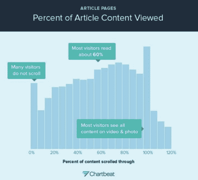
You can also consider inserting related content links about 60-80% of the way down the page, as this is the area where users start to lose momentum and are prone to clicking away.
Conclusions
The core of improving dwell time through content really boils down to what I mentioned earlier about maximizing user value and minimizing how much effort is asked of the visitor. This is really where it gets tricky because you want users to dwell on your pages for longer, but you want to ensure that the time they spend is useful.
A user may stick on a page for 6 minutes, but if the content wasn’t valuable or relevant to their needs, you’ve only wasted their time and helped create a negative experience. Thus, if you want to improve dwell time, you need to deliver more engaging pages that work, look great and leverage multiple types of content to deliver actionable value to users.
If your content is great, users will have no issue sticking around.


