I don’t even know where to start with this. Target launched a new site last week. I guess they’re pretty proud of it, but they’ve managed to completely fail in so many ways.
The Backstory
In 2001, Target elected to partner with Amazon in order to leverage Amazon’s e-commerce technology. This may have made sense at the time, but Target should have started to move toward being off of Amazon by the time the 5 year deal was done. Instead, it has been renewed a couple times and was extended through 2011. The last renewal was announced 2 years ago and Target knew at the time that they were going to move off of Amazon. That means they’ve had at least 2 years to get this right. That’s a LONG time.
The Good
Honestly, I haven’t found a lot that’s good about their new site. It’s possible that getting away from Amazon’s technology will benefit them in the long run and that would be a good thing.
The Bad
There is a lot wrong with this site. It’s definitely not ready for prime time and was either rushed out to meet a deadline or there is a big team of idiots behind it. Maybe both. A quick run through the site exposed a lot of basic items that are being handled poorly. I could probably spend days picking this piece of junk apart, but here are a few things you guys can learn from:
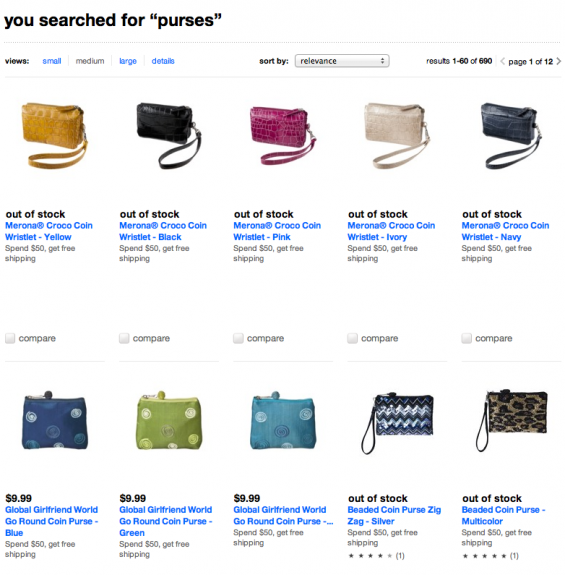
Don’t feature “out of stock” items at the beginning of a search result – It’s not difficult to filter these out or at least not show them first. It’s basic but if your customers show up to that page and see that half the products are out of stock, they’re going to move on.
Check for Validation – Maybe you don’t need to shoot for a perfectly valid site but it’s always a good idea to make sure you don’t have a ton of errors. Target.com’s homepage has 244 errors showing. Most of them are basic and missed out of laziness.
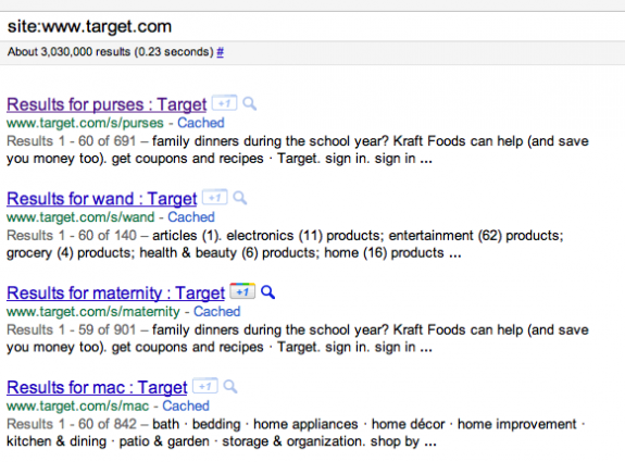
If a site: search doesn’t have your homepage in the first few results, there’s likely a problem. If the results are full of search results pages, you’re f*cked. – You can learn a lot from running a site: search on your own site. Look at the titles. Are they something you would click on? Now look at the descriptions. Are they unique and interesting? In Target’s case, the answer is “Hell no!”
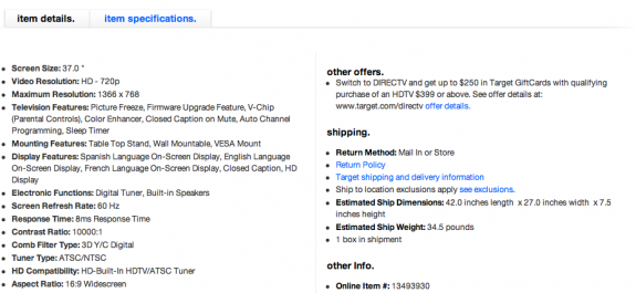
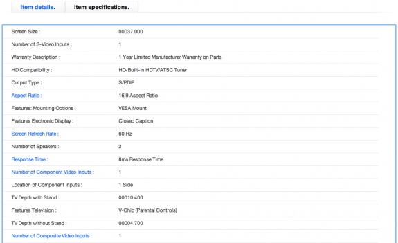
Don’t use tabbed navigation just to be cute – I’m not sure what they were thinking here, but on their TV pages (and likely others), they have tabbed navigation about half way down the page. One option is “item details” and the other is “item specifications.” The “item specifications” tab doesn’t offer anything unique.
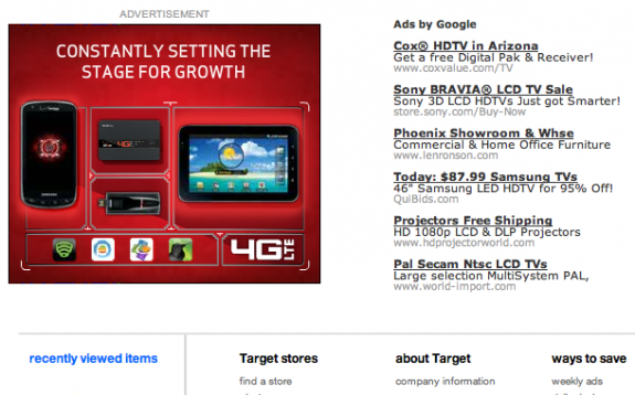
If you’re selling something, don’t throw AdSense ads all over your site – There’s no logical reason to let your competition show ads on your site. If it’s making enough money to warrant putting them in the page, you’re failing at conversion.
Don’t forget to replace characters with HTML entities where necessary. – This is a good way to break something. For example, Target is outputting quotes to meta tags and breaking the code rather than using the proper entity (click on the image to see the suckiness in all its glory).
I could nitpick the hell out this site. Viewing the source nearly makes me sick. There is javascript in places it doesn’t belong, random css scattered everywhere, and as I noted above, all kinds of validation issues.
The Fugly
Sometimes people do things that warrant a good beat down or at least being fired over. I’m normally not a fan of calling for peoples’ jobs but when a project that appears to have been ongoing for 2+ years shits itself like this, someone’s gotta go.
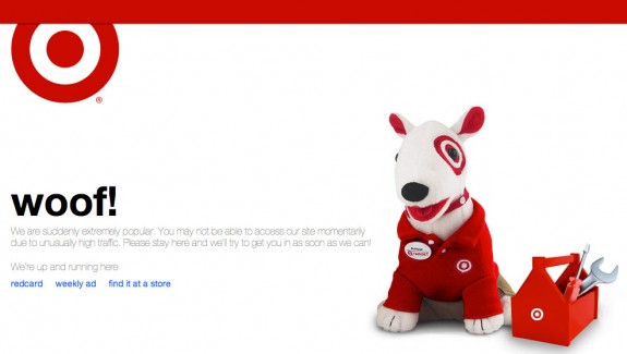
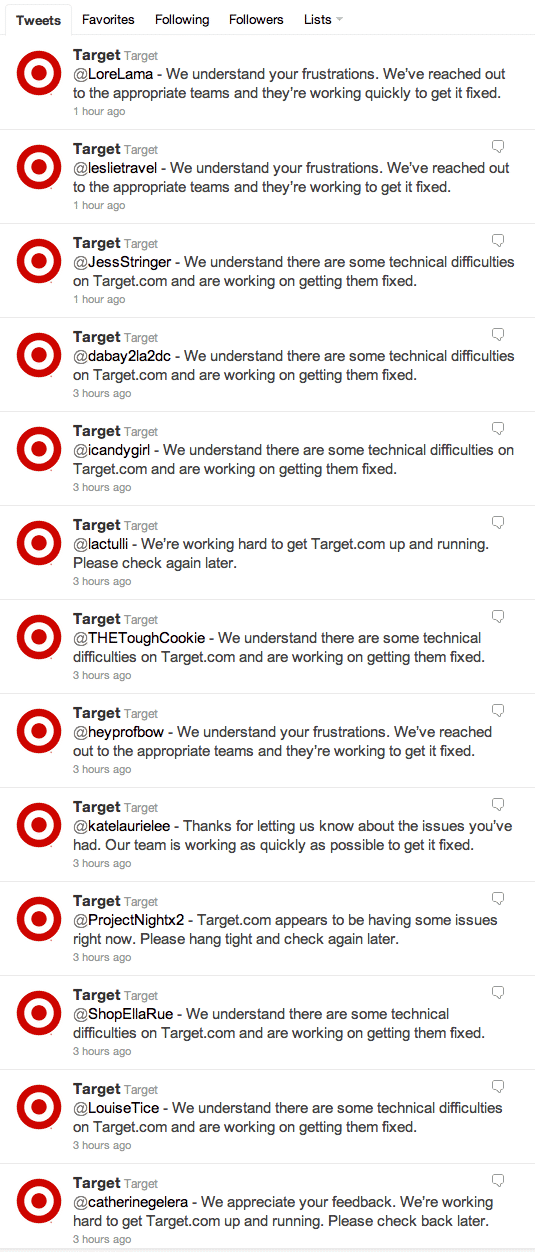
I have heard reports of long outages since the rollout. Last night it was offline for at least 5 hours that I was monitoring it. That’s not good. That’s a miserable, amateur, fail. These days, unless something is completely unexpected, a site should NEVER be unavailable. Even if you’re doing maintenance, there are very few excuses to have a site go offline.
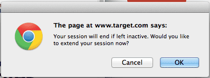
Now that the site actually loads and I was able to check it out, I ended up poking around for a bit. One of the pages was left open in a tab that was long forgotten and minimized. Well…guess what? That little tab came back and started haunting me. After being hidden for a few minutes, I got the following message and the tab brought itself to the front of everything on my screen.
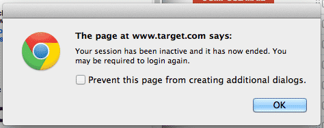
I decided to close that and see what happened if I left that tab in the background. A minute later, I got this one.
Come on Target. I’m not logged in. This is amateur crap. You don’t pop messages up like this. You’ve guaranteed that I won’t be back. Do you guys honestly think this is smart? Let a session die silently. Even if you think this is a reasonable thing to do for people, don’t do it to guests.
How Could This Happen?
We may never know what has gone down behind the scenes at Target.com but there are quite a few pieces of evidence to base some theories on.
Too many cooks in the kitchen – According to the numbers in Target’s press release, they had far too many people involved in this:
More than 20 vendor technology partners were involved in the construction of the new Target.com.
Key contributors include:
SapientNitro: Lead partner and primary systems integrator
IBM: Multichannel eCommerce platform provider
Huge: Site creative – visual and interactive design
Infosys: Global inventory visibility and cross-channel order-management functionality
AT&T: Hosting provider
Laziness or a lack of quality control – A lot of issues I’m seeing on Target.com are basic. They are things that should be able to be cleaned up quickly and easily if they just put in a little bit of time.
Lack of knowledge sharing – Some of what I’m seeing here could likely be corrected if people just communicated internally and worked together to create a better site. I wouldn’t be surprised if the developers have never talked to an SEO over there. The whole thing reeks of red tape & corporate segregation. If that’s not the case, shame on the team that did this as it’s half assed and they might as well be stealing from Target.
Overall, there are a ton of lessons to be learned from this. I just can’t believe that they rolled this site out after having so much time to work on it. I don’t see how a company that lets this kind of mess happen can survive for more than a few more years. It’s no wonder they’re getting their butt kicked by Walmart.
Update – September 13
Missoni for Target Launched – Site Down for Hours
It looks as though Target launched a new product line called Missoni for Target today. The site has been down for several hours. I know of an IT department that needs a good overhaul.


