The huge benefit of using QR codes is in how many ways they can be implemented. A QR code can be placed almost anywhere; on print materials such as flyers, posters, and product packaging, or even displayed on websites. The single most common place I’ve seen them is in advertising in restaurant bathrooms. The bar codes that are created can display a phone number, email address or plain text message. The most common use is to direct the user to a URL.
The Problem with QR Codes

You can’t just serve them your desktop website.
Yes, technically, most smartphone browsers these days can render a desktop website, but it’s certainly not an ideal experience for your user.
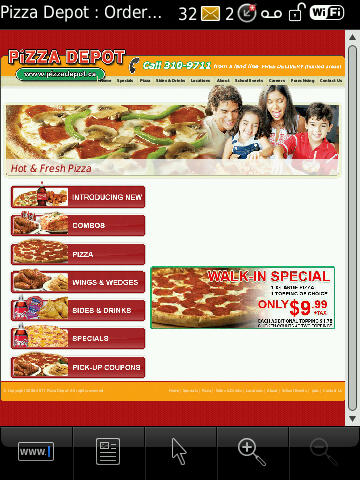
Today I got a flyer in the mail from a local pizza place, with a QR code going to their desktop website. Despite being nearly un-readable on my BlackBerry, it took a long time to load, devouring my data along with it. Scott Stratten ranted about this same problem amongst realtors the other day. I’ve recently even seen QR codes that point to sites built completely in Flash.
How to Use QR Codes Successfully
If you’re considering using QR codes in any of your campaigns, keep the following in mind:
- Don’t print QR codes on glossy paper. The reflection from the camera’s flash or overhead lighting will make reading the code impossible.
- Use an appropriate size for your printed QR code. Codes smaller than 1.5 inches square can be difficult for a user to focus on, even when holding the device up to the code. The greater the distance the code will be scanned from, the larger it should be displayed.
- Screen resolution for mobile devices ranges from 240×320 pixels for older BlackBerrys to 640×960 pixels for the iPhone 4 retina display. Your website should be able to display without horizontal scrolling on a wide range of resolutions; whether you accomplish that with a fluid design or device-specific layouts and CSS is up to you.
- Keep mobile websites lightweight and fast-loading. Not all users will have the latest 4G device; they could be using a 3 year old phone on the Edge network, or inside a building with a poor signal.
- Don’t use Flash! iOS devices and BlackBerrys can’t load it.
- Keep use of JavaScript and HTML5 to a minimum. While newer devices with Webkit-based browsers can handle these technologies, older devices will struggle.
- Keep calls-to-action simple. Typing on mobile devices can be difficult, so don’t require users fill out long forms.
Bonus tip: Direct your QR code to a URL with campaign tracking parameters so you can monitor the results in your web analytics.
Sending mobile users to websites they can’t access is killing your ROI, and making you look stupid in the process. With a little common sense, you too can have a successful QR code campaign.
Photo: clevercupcakes/flickr
