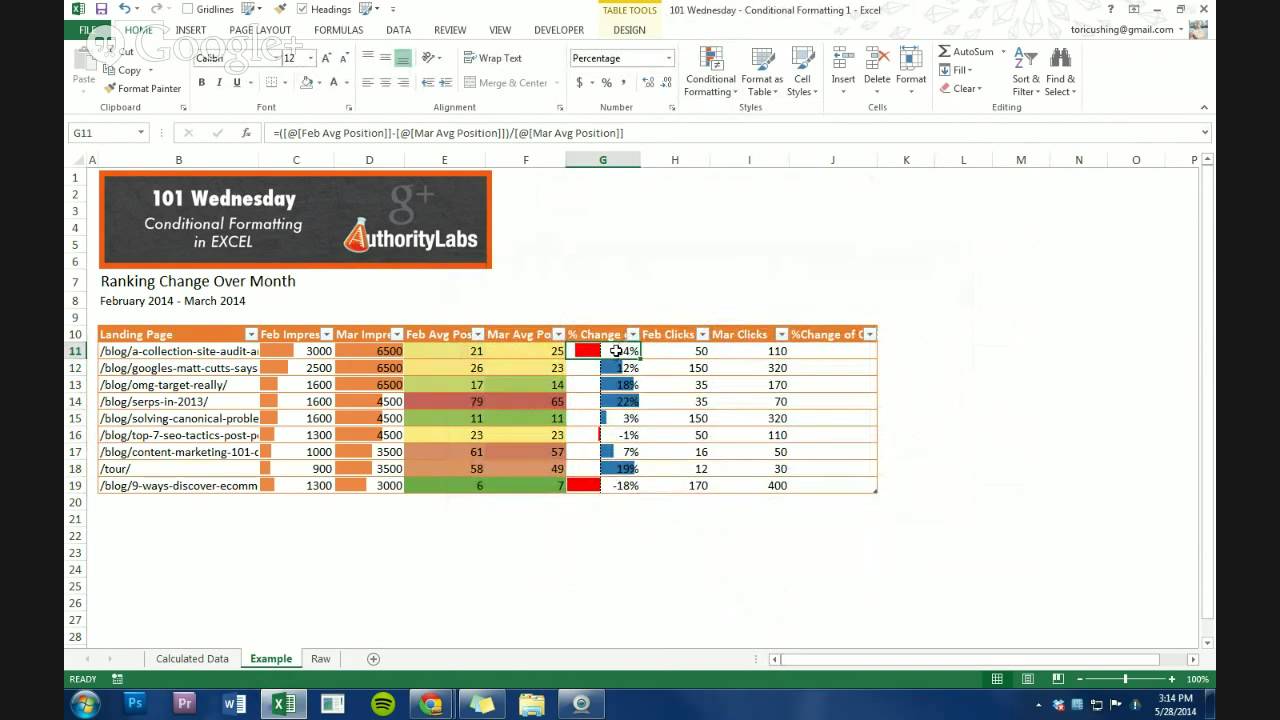
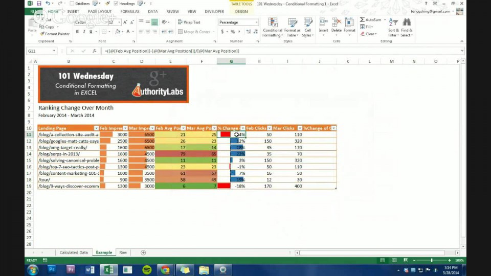
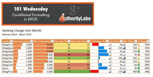
Formatting in Excel has always been a major point of focus in our 101 Wednesdays Google+ Hangouts. Our latest wasno different. It’s pretty much the Cushing way to focus on making data pretty. It just so happens that we, and you, can use pretty colors and icons to quickly show how well data is doing in data reports. Below is a snapshot of what you’ll learn in about 20 minutes in the video below.

In the video below I went over how to add data bars, color scales and icon sets all based on the custom conditions of your data. If you have any questions please feel free to ask and if you want to learn more please feel free to comment with what you would like me to go over next!
Do you want to try this for yourself? Download the Excel sheet and follow along.


