Are you a WordPress user?
Well if you are, I highly recommend attending a Wordcamp conference. They’re a multi-city conference that pop-ups in cities all over the world. A casual, locally-organized conference, Wordcamp covers everything related to WordPress, the free and open source personal publishing software that powers over 75 million sites on the web.
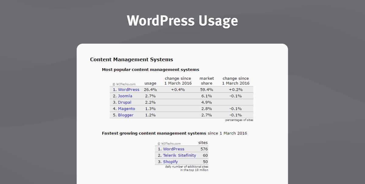
I recently went to the Wordcamp in San Diego to sharpen my WordPress knowledge. Especially since WordPress is kind of a big deal. It powers 26.4% (and counting) of the Web. Each day over 500 new websites are being created on WordPress. Bloggers, businesses, and brands flock to WordPress for it’s extreme accessibility and customization.
Whether you’re a website developer, coder, or a n00b when it comes to building websites, WordPress has a tremendous amount of flexibility for all skill levels to create beautiful websites with. Chose from pre-made themes from companies like Themeforest or Genesis to create a website using a template format or have a web developer build a custom site for your eCommerce store.
One of the issues with WordPress is that you can’t just throw up a Genesis theme, add some content, and call it a day. There’s a lot of optimizing work that needs to be done in the backend of a WordPress website, and even more optimizing with the actual site design and content.
The speakers at Wordcamp SD had quite a lot of tips to share about WordPress, especially when it came to optimizing for things like performance and user experience. Here’s a few takeaways from speakers Austin Gil and Chris Ford about just that.
Font Families
Fonts are extremely important for brands, so we do need to keep them. But if it’s possible, use System Fonts. System Fonts are the fonts that are pre-installed on a computer. This means a user won’t have to actually download fonts in order to see your website. You can also use Google Fonts, because Google.
Icons
Have you recently purchased an icon sheet off of Adobe Stock? Turns out, most of the time we don’t use all of the icons that come with a design sheet. Which brings us to Austin’s next point, there’s no reason to upload or have all of the icons that come with a sheet imported to your WordPress website. That is just taking up extra space that isn’t needed, and slowly down the load time of the site. Upload only what you actually need on the site to help save space and increase performance.
Fontello and Icomoon are great ways to find the icons that you actually need, which will help minimize your overall icon library by only uploading what you actually use. Font Awesome takes 270kb to load, which is a lot. Bootstrap has an option called Glyphicon, which is 60% kb smaller than Font Awesome. Fontello is even less. Fontello is only 19kb, which 93% smaller than Font Awesome. Unless you’re using 375+ icons, avoid using weighty programs like Font Awesome and stick to options like Fontello, Icomoon, Fontello and Glyphicon.
Sliders and Carousels
Just don’t use them. They bloat your page, they’re not great for SEO, not accessible, and they don’t convert, especially after the second slide. How often do you, yes you, actually wait to see the second, third, and fourth slide image on a slider? Exactly, and you’re not the only one who isn’t waiting.
Avoid at all costs using sliders and carousels on your website. Have a still image with a headline and call to action button instead. This provides better performance and gives the user a clearer direction of what action you want them to take.
Speaking of images, Austin recommended only using these file types: use jpg, png, or svg only. Other file types can slow down a website drastically.
Images
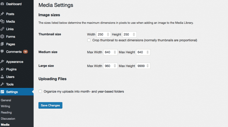
WordPress automatically makes 5 sizes for each image you upload, but you can go into settings and change the default sizes to customize them for your website. To do this, go into settings, then media and change the auto image size settings to your most used sizes.

Flat Design Can be Faster For Performance
Flat design refers to simple images. They’re images that don’t have a lot going on in the actual image. For example, an image of a restaurant full of people is a lot to process. That’s a lot of data to absorb when you think about each person, their outfits, the tables, the lights hanging above them, the food, and drink glasses on the table.
Simpler images, also known as flat images, are better for performance-based websites. A photo of the restaurant with a couple sitting in the middle of an empty restaurant staring into each other’s eyes over a plate of spaghetti is a flat image compared to the image of a packed restaurant.
How to simplify images that aren’t flat images? Austin recommended adding overlays, blur backgrounds, try black and white, or do a color mask. Adding these to a complex image can reduce the size by 13 to 30%.
Caching
One thing Austin mentioned during his presentation was to clear your cache each time you make changes to a site. You can do caching manually or you can do it with a WordPress plugin like WP Rocket, WP Fastest Cache, and W3 Total Cache.
Content
Content creators need to think about how to write the perfect headline, how to align copy writing with SEO goals, video content, and keywords. When thinking about how to write the content for your site, ask yourself the following questions:
- Who is your audience?
- What is their skill level?
- What do they most need to do?
- What is their biggest struggle?
- How can you reduce the pain points they’re going through?
Support Documentation
What a lot of people don’t think of as user design, perhaps because it doesn’t come with bright colors, is the document and support segment of your website. What is the support process like?
Write documentation to show people how to actually use the product or service. Make it easy to understand and follow, and write like you are writing instructions to your mother. Think outside of the box when writing documentation instruction and try recording or making a video to show how to use the product.
Is your product something that needs no explanation? Great! You’ll still need to provide a central place for support questions, though. This is relevant to any and every business, whether you’re a jewelry retailer or a plugin developer.
Chris made a great point in her presentation that no one knows your product as well as you do. Show off it’s coolness by having documentation to explain the product and a solid support center to respond to any questions.


 Stat Source: ManageWP