Having a website is great. Every business should have a website. Having a website that converts is even better.
It’s easy to scram together and throw up a website, add a touch of SEO, and say voila! But, that kind of process won’t get you conversions. You have to actually put thought into the messaging and user experience of a website or landing page before creating it. Without doing so, you’ll have a nicely designed website that is just fluff. It will sit in cyber space competing with the other mediocre websites for the highest bounce rate.
Instead of watching your bounce rate increase, let’s look at how you can create a website or landing page that converts. Whether a conversion means more online sales, opt-ins, or form fill-outs, here’s how you can increase the chance of a conversion.
Check the Analytics, Frequently
Many people fail at CRO simply because they don’t check their analytics. Taking the time to check analytics and data is going to be the fastest way to diagnose where the conversion issue is occurring. Traffic may be dropping off on one specific page and increasing on the wrong page. Without checking the data first, you end up redesigning the entire website, instead of the two pages that needed it.
When checking the analytics to optimize for conversions, follow these steps:
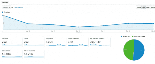
Go to Google Analytics and analyze the brief overview.
- What is your bounce rate?
- How many new visitors versus repeat visitors are you receiving?
- What should that percentage split actually be?
- Do you need more repeat visitors versus new visitors?
Sometimes your best customer is a repeat customer, especially when it comes to online. Having a returning visitor certainly isn’t a bad thing, unless having more new visitors helps align better with your goals. By checking Google Analytics’ overview regularly, you’ll be able to know who is coming to your website the most and how you can better optimize individual pages for conversions.
Look at the Behavior Overview data.
- What pages are people going to the most?
- Where is traffic being sent and what is the average time spent on these pages?
- Is the traffic going to the correct pages or do you need to optimize the pages different?
Sometimes you can’t control where a user explores on your website, so go with it. Enhance the pages they are going to the most and build a conversion funnel on those pages, instead of resisting and trying to force a user to go elsewhere.
Check the Conversion and Goals section. Every website should have conversion goals setup in Google Analytics. It’s how you can track movement and real-time conversions on your website – and it’s free. I take that back, it’s priceless data that you need to help optimize your website with.
A/B Test Variants With Minimal Changes
A/B testing is essentially choosing regular fries over curly fries. Which do you chose? While I chose curly, you might chose regular fries. Some of your friends might prefer regular fries as well, while a majority of your family members loves curly fries. The fries with the most votes is the dominant fry, and ultimately the one a fast food restaurant should promote in their next marketing campaign.
Taking this analogy to websites and landing pages, it’s essentially the same thing. We are making very minimal changes of a page, such as a headline change, call to action button color change, or banner image change, and testing to see which variant people respond best to.
A/B testing is great, as long as you know how to A/B test properly, though. Here’s a few tips on how to A/B test for conversions:
- You need visitors. When A/B testing a specific page on a website or a landing page for conversions, you need a large amount of traffic being sent to the page in order to have accurate enough data. A couple hundred people isn’t a large enough audience to test two different variants of a landing page. Why? Unless your demographic is about > < that big, you’re going to want to reach about 20% to 40% of your audience to give the test an accurate run.
- Direct traffic using PPC. Sure, you can run email campaigns and wait for visitors to organically appear and respond, or you can speed up the process since we don’t have years of time to test and push visitors to the variants using ads. Run Facebook Advertisements and Google Adwords directing traffic equally to both variants. Then, wait and see what happens. Which variant are they converting to the most? Which page do they bounce off of the fastest?
- Run the test over time, not over night. Unless you have a big budget, it may take awhile to get a large enough audience to see the two variants. Plan on the A/B testing process taking at least a week or two, afterall, your expecting to run your website forever. So, why not take the time to A/B test variants now, instead of later when you need to fork out another PPC budget for testing?
Put the User First, and Your Marketing Brain Second
It’s easy to get wrapped up in data and forget about the user itself. Your website or landing page has a specific purpose. Users are expected to make some form of action or engagement, whether it’s to gather new information, make a purchase, sign up, etc.
In order to make these conversions happen, there needs to be some sort of connection with the user. When trying to optimize for conversions, put yourself in the user’s shoes and ask yourself the following:
- What do you love about your favorite website? Is it the colors they use, the products they offer, or the layout of the homepage? Think about the websites that you love and why you enjoy visiting them. Try and replicate those items in your own website or landing page.
- What does the future look like for the user if they make an action on your page? Too often we use call to actions that are bland and boring, like “Call Now” or “Learn More”. That doesn’t actually tell a user how their life will change by picking up the phone or clicking a button. Change your call to actions to speak to the end result of making such action.
- Does my messaging make sense for someone who doesn’t know my brand? You’re not a Kardashian. Not everyone knows who you and your brand are. So, are you making it clear when someone lands on your page, without having to scroll, what it is your brand does?
- Are you credible? Nobody will invest a dime with someone they can’t trust. Display your brand’s credibility by adding testimonials, preferably video testimonials so it feels even more credible. If the brand has been featured in a top magazine, television show, or received a well known rating then showcase it. Provide as much credibility upfront to help increase conversions.
There’s hundreds of different methods for optimizing websites and landing pages for conversions, but these are a few you can implement right away. Comment below with a few of your favorite conversion optimization methods!


