Whether you’ve created a hundred landing pages or don’t know how to create your first, there is always room for improvement (and conversions) with landing pages. Especially since only 22% of businesses are actually satisfied with their conversion rates. More often than not, businesses are missing out on potential conversions because of poorly thought out layouts or misleading headlines. Pay-per-click money goes to waste and marketing dollars are spent endlessly trying to create the highest converting landing page, without ever evaluating the landing page itself.
Follow the steps below to be one step closer to creating a high performing landing page that actually generates results.
Define the Purpose of the Landing Page
Before the design can be sketched and the content drafted, the purpose for the landing page must be defined. There are several reasons for needing a landing page, such as gathering new leads, promoting a webinar or e-book, creating a central place for sign ups, etc. When trying to define the reason for your company’s newest landing page, ask yourself the following:
- What is the benefit of the landing page for the business?
- What is the benefit of the landing page for visitors?
- Who is the landing page for?
- How often should it be updated?
- What is the offer?
Once you’ve clearly defined the purpose of creating a new landing page, it’s time to begin the design process.
Create the Landing Page
Minimization is Your Friend
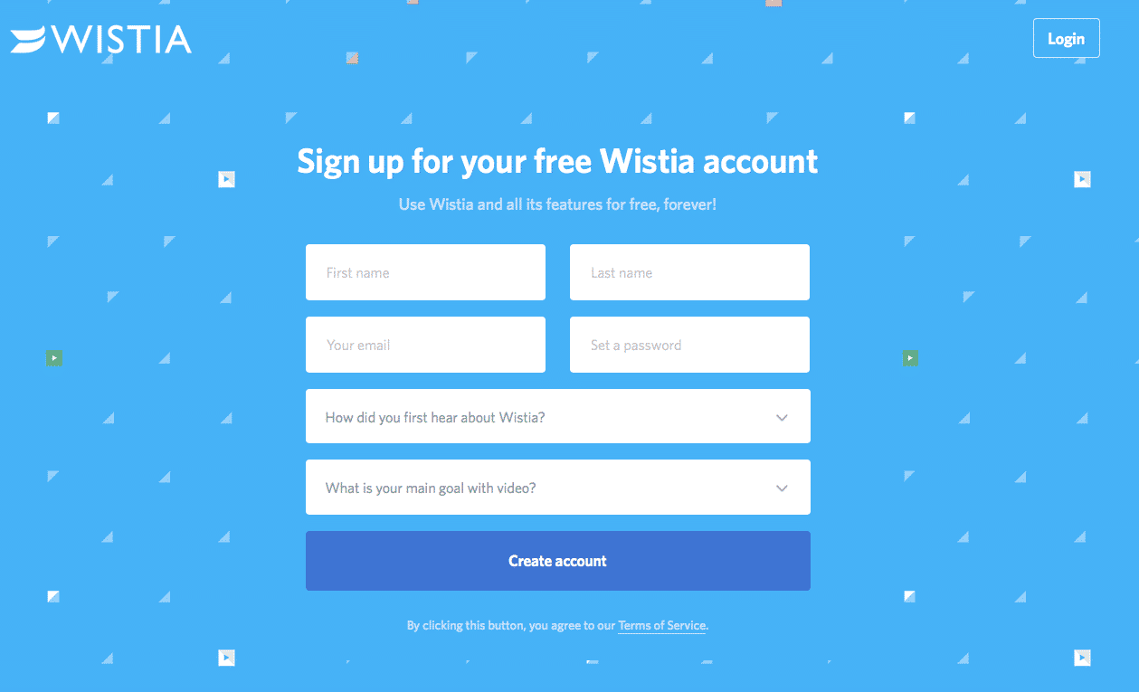
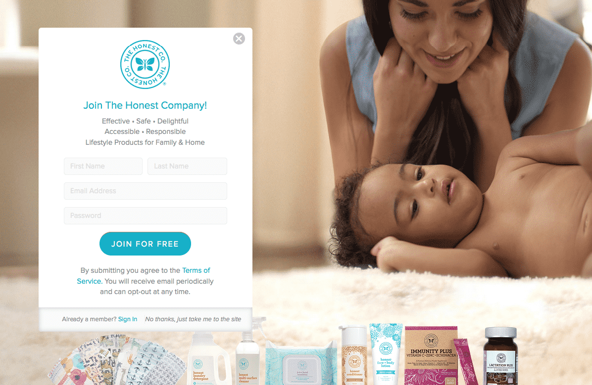
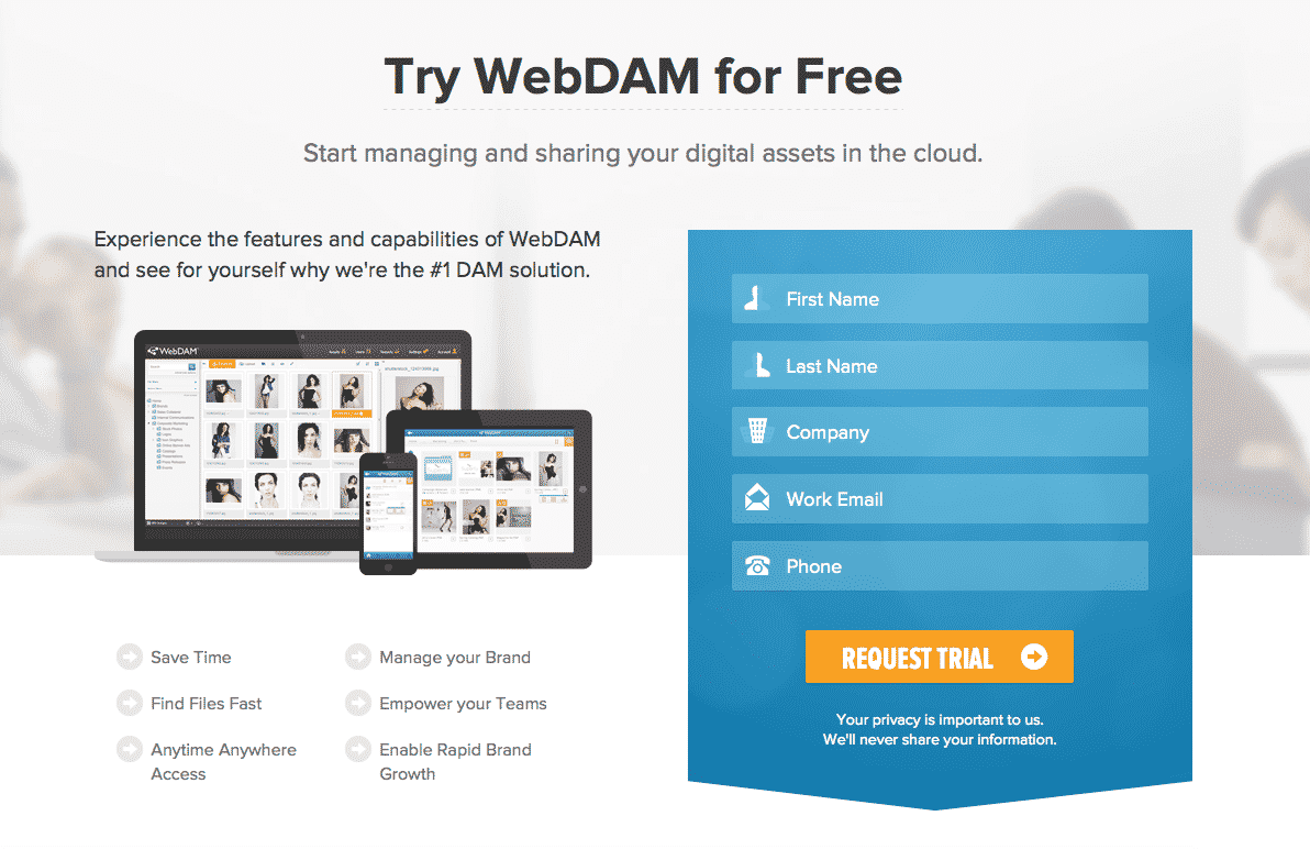
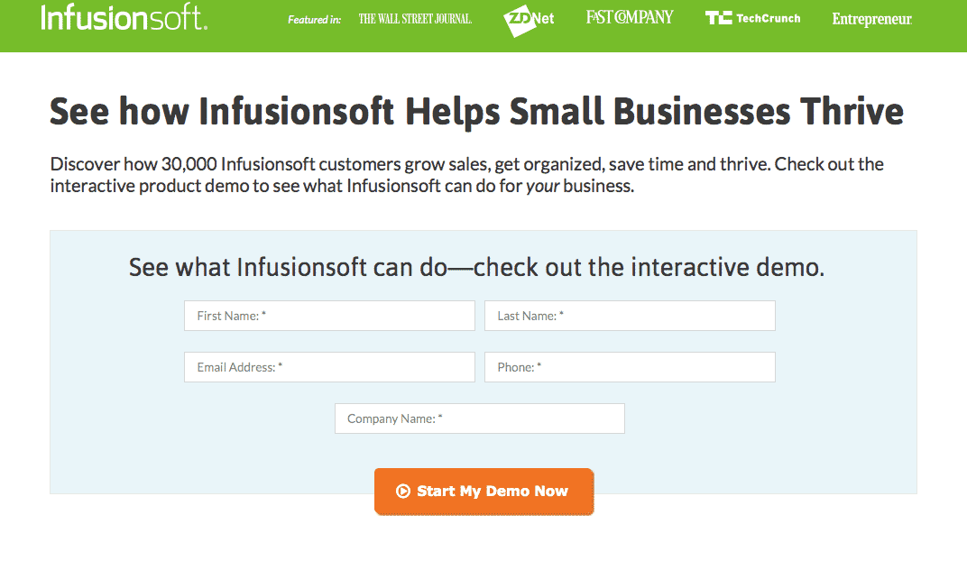
Keep the landing page design as minimal as possible. Let the offer speak for itself without cluttering the page with over designed features. Eye flow plays a big role in conversion rate and can misguide a visitor when there is too much design and not enough clarity. Create a clear map of where a visitor’s eye should follow to avoid confusion and help keep the design minimal.
Make Your Point Above the Fold
Users don’t want to have to scroll to get to your point. It’s exhausting and takes too long for any demographic. That’s why you need to put your most compelling headline, call to action, and image above the fold to get to the point immediately. Include additional information past the fold to give the visitor more in-depth points about the product or offer.
Bullet the Most Important Information
Along with scrolling, having to read is exhausting for users. Compliment the layout design by bulleting the most important information. You can do this above the fold, as well as below to include additional points of interest.
Include a Video
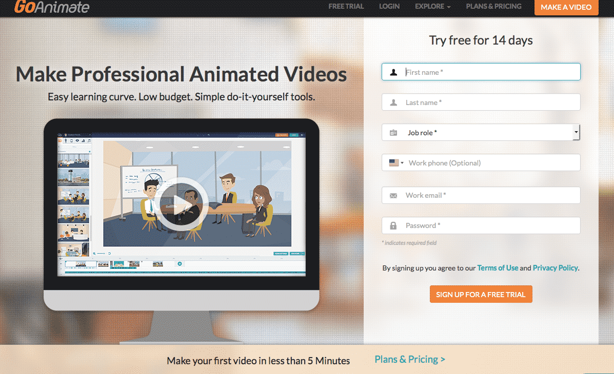
Adding videos to a landing page can increase conversions by 86%. We have already seen videos improve engagement on social media, as well as help page ranking. Adding a video to a landing page can help decrease the amount of text content needed and provide a more simplified, easier to understand layout. Video is also an easier way to digest information for visitors.
The Landing Page Better Be Mobile-Friendly
For those who still aren’t with the times and struggling to get with the mobile game, here is your friendly reminder. Everything we create online must be mobile-friendly, including landing pages.
Create Exciting Content
What is Your Call-To-Action?
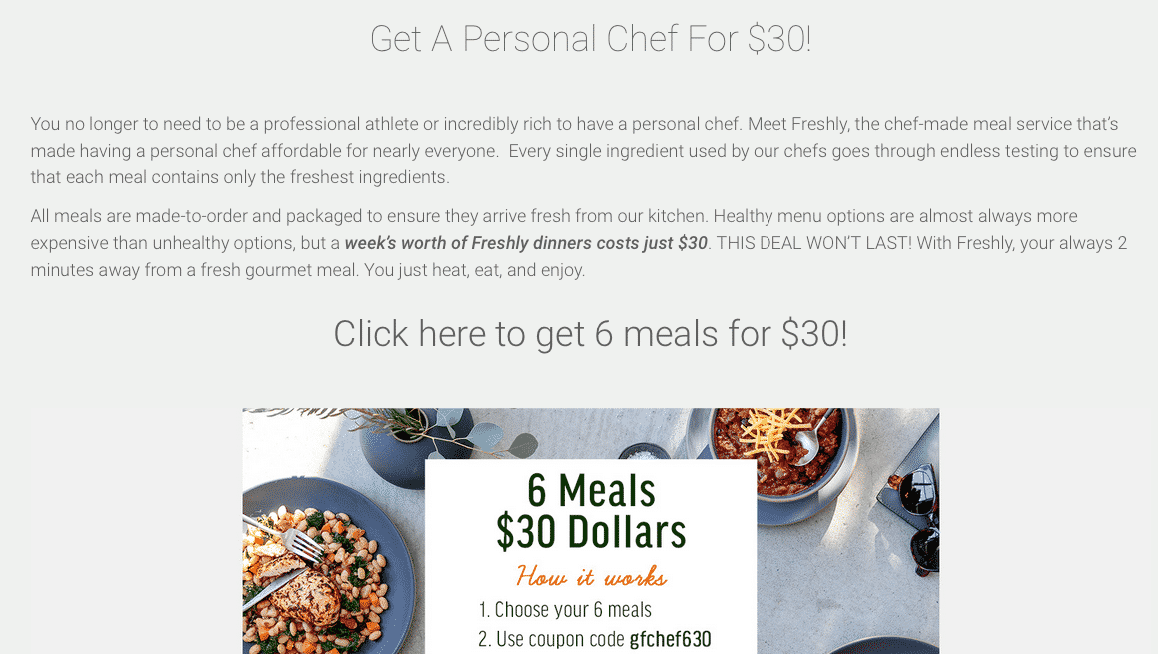
If you can’t tell what the call to action is from your landing page, a new visitor definitely won’t be able to. Think back to the idea of minimal design when defining the call to action and make it as simple as possible. Try to avoid the typical call to actions, “Act Now!”, “Sign Up Today!” and get creative when drafting the headline.
What’s the Benefit?
Give me a good reason why I should give you my email address, knowing that you are most likely going to add me to a subscription service or sell the information to someone else. The benefit to fill out a form needs to be clear and inline with your demographic. If you’re offering men 50 years and older who live in Nevada passes to Seaworld after they fill out the form, you’re marketing the wrong offer.
Connect All of the Content Together
If you’re advertising a Website Clicks ad on Facebook that links to the landing page, the content on the Facebook ad needs to match the content on the ad. The call to actions should be similar, if not the same, and the offer must connect. There are very few things in cyber life that are more frustrating than clicking on an ad and being redirected to an irrelevant landing page.

Add Testimonials to the Page
Include testimonials on the landing page that directly relate to the offer and are inline with the call to action. Having two to three testimonials can help increase the amount of conversions received by making a visitor feel more comfortable about contributing their personal information or signing up for a new service.
A/B Test the Landing Page
After the design and content has been created, you’ll want to duplicate the landing page and add minimal changes to test which page results in the most conversions. This is called A/B testing and is used to optimize conversions. Only 52% of companies and agencies that use landing pages also test them. President Obama used A/B testing during his campaign to raise an extra $60 million. Testing different variations of the same landing page will inform you of what visitors respond best to, and ultimately help you design the “perfect” landing page for your audience.
Make slight changes to the design using a second landing page to A/B test with. The point of the A/B test is to make small changes to certain areas of the landing page to see what and if changes affects results. Try changing the main image or using a different primary color as a design change. A content change can be a headline or call to action variant, leaving the offer the same.
Whichever change you make to your “B” landing page needs to be a small change so you can properly measure results. Landing page B can’t be judged fairly with landing page A if you changed the offer for both. It has then become two different landing pages with two different objectives and will not give an accurate reflection of results.
Have a few landing tips of your own? Comment below with some of your most successful landing page edits.
