Since the complete rewrite of AuthorityLabs about a year ago, we have been tirelessly at work talking to our users, and more importantly, listening.
We took your feedback and improved the interactions that are most important to you and the workflow associated with keeping an eye on your most critical search engine ranking data.
Our overall goal was to eliminate the confusion and friction in getting around the site and get you access to the data you need more easily. To do this, we took a three tiered approach:
- Simplify the visual presentation and workflow
- Eliminate contextual disconnect
- Provide shortcuts to get where you need to go more quickly
If you don’t want the full story (which I can’t believe you don’t) you can skip to the end for the bullet points.
Simplify
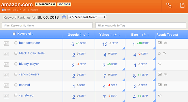
The first thing you will undoubtably notice, is the site’s overall facelift. This is not purely cosmetic, but rather a foundation based on clean lines and flexibility. We have consolidated all of the site’s navigation into one area. The icon-based navigation items are contextual to where you are on the site and provide a quick visual recognition for things you can do. No more searching for the right button.
This facelift also has some hidden gems in it. First of all, it’s responsive on most sized screens from tablet to HD monitors. Given the extent of data it’s currently not fully responsive on phones yet, but maybe soon.
Speaking of icons (and responsive) we’ve swapped out almost all of the image icons for text icons. These icons are not only visually stunning, but more accurately representative of the functions they represent. Thanks to Dave Gandy (http://twitter.com/davegandy) and his FontAwesome project (http://fortawesome.github.io/Font-Awesome/) for an amazingly easy icon strategy.
Part of the process of simplification, was reducing the friction in switching domains and accounts. We’ve added contextual navigation links that allow you to see a list of your domains and accounts from every page. No more dashboard to see all of your domains, or profile to switch accounts.
Lastly, inviting users is easier than ever before. Now you don’t have to jump back and forth for create a team for your new user, you can select from an existing team or create a new one on the fly as you invite them.
Eliminate Disconnect
A major point of frustration was the disconnect between the sorting mechanism (drop down list) and the table of data. This has been eliminated by column header sorting. You can sort by nearly any data point with a single click.
Date and delta change has also been improved by linking them in a data header that gives you a better idea of what you are looking at on the page and what will happen if you change them.
Filtering by keyword text or by tag has been separated and improved. You can click a tag to filter and filter further by keyword text to get a more focused view of the data you need.
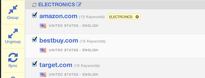
Overall, we’ve strived for less intrusive interactions. One of the most obvious is seen when adding tags to multiple keywords or grouping domains. The navigation appears without jumping the items you’re interacting with, but if you want to get back to the nav underneath you can just hover over it and the page adjusts. Pretty neat.
Provide Flexibility to see data how you want to see it
It’s back!!! Conspicuously absent from the last rewrite was domain syncing, but it’s back. Also, as an added bonus you can now view a comparison page of any synced domains. This is new, but has been a request by many for a long long time. 🙂
As part of the syncing and compare function we thought it would be nice if you could edit group names so that you can more easily identify your important groups. A group doesn’t have to be synced to be named.
And lastly, you have been asking for a way to hide data that you don’t want to focus on. So with this update, you can now customize the columns in all data views from the account level and even more fine-grained at the domain level. This will allow you to focus on just the combination of domains, volume, and type indicators you care about for each of your domains and/or clients.
What’s next
We’re not satisfied to stop here. We realize that there are still more ways that we can improve. Here’s just a small list of what’s in our current to do list:
- Faster loading for large data sets (this is our top priority)
- Interface API: Our goal is to give you access to the data so you can turn it into fancy reports on your own if you like
- Multiple formats for all data views: If you don’t want to go API (or even if you do) we’re working to provide you with all data views as pdfs, csvs, and of course, API responses
- Customizable invitation emails: So you can include a special note for that special someone
- Filter on multiple tags: So you can drill baby drill
- Other stuff I can’t tell you about yet. We have to have some surprises.
TL;DR
Improvements
- Gave the site an overall facelift
- Cleaner lines and flexibility for future data visualization
- Text icons from FontAwesome for icon-based navigation
- Responsive design from tablets on up (no phones yet)
- Improved inviting users
- Moved sorting to column headers
- Made date and change delta selects make more sense
- Filter by keyword and tag is more sensible
- Better interactions overall
New Stuff
- Added ability to switch domains and accounts from any page
- DOMAIN SYNCING!!!
- Compare domains side by side
- Name groups
- Customize columns on all data views
I hope that these upgrades help you to be more productive and efficient and if you run into anything that needs improving, click the support link and let us know.

